Adding custom HTML and CSS to GitHub README
Published Last updated loading views

Are you tired of the same old, same old personal GitHub profile README? Or are you just looking for inspiration on what to do with your own? Great, you find a perfect post that will show how you can go above and beyond to what’s offered when styling your personal README.
GitHub Profile README
Before we start, what is a GitHub profile README at all?
As of July 2020, GitHub allows you to create a repository with the same name as your username and use its README to add some personality to your page.
You’ve probably seen a lot of these with a lot of data in them. Some of them are neat looking. Some of them are full of information. But almost all of them consist of:
- Intro about the user and their career orientation
- Possibly some programming languages they know or use
- Then you can find a bunch of “add-ons” or “feeds” of some sorts
- You can connect your GitHub README with Spotify, your blog, or almost anything that has an RSS feed and then show it on the README
- You can show your GitHub stats - PRs merged, commits pushed, your GitHub contributions, contribution streaks etc.
- Some of them even have GIFs, images, and so on.
But today, I will show you something else.
I will show you how to add any HTML page you want and “embed” it inside the README. We’ll achieve this by adding custom HTML and CSS inside an SVG file.
Custom CSS and HTML in an SVG
GitHub supports adding HTML in Markdown, but it is pretty aggressive when removing HTML that can be potentially dangerous to users. Things like scripts, iframes, and similar will get removed or “silenced” to avoid malicious content from being served to users.
Luckily, there’s one way to sneak in some HTML (or a web page) inside the README. You can do it via SVG and foreignObject SVG element. Let’s see how to do it.
First, create SVG file in your favorite editor like hello.svg:
<svg fill="none" viewBox="0 0 600 300" width="600" height="300" xmlns="http://www.w3.org/2000/svg">
  <foreignObject width="100%" height="100%">
    <div xmlns="http://www.w3.org/1999/xhtml">
      <style>
        .container {
          display: flex;
          width: 100%;
          height: 300px;
          background-color: black;
          color: white;
        }
      </style>

      <div class="container">
        <h1>Hi there, my name is Nikola 👋</h1>
      </div>
    </div>
  </foreignObject>
</svg>
Awesome, if you open it, it should look like this:
Pretty basic, nothing too fancy. What’s important to note here is that it’s
possible to add CSS and HTML inside an SVG, and it will work nicely. Also, notice the
style block. Right now, it only sets the background color. Come on, let’s push it
further.
<svg fill="none" viewBox="0 0 600 300" width="600" height="300" xmlns="http://www.w3.org/2000/svg">
  <foreignObject width="100%" height="100%">
    <div xmlns="http://www.w3.org/1999/xhtml">
      <style>
        @keyframes hi  {
            0% { transform: rotate( 0.0deg) }
           10% { transform: rotate(14.0deg) }
           20% { transform: rotate(-8.0deg) }
           30% { transform: rotate(14.0deg) }
           40% { transform: rotate(-4.0deg) }
           50% { transform: rotate(10.0deg) }
           60% { transform: rotate( 0.0deg) }
          100% { transform: rotate( 0.0deg) }
        }

        .container {
          background-color: black;

          width: 100%;
          height: 300px;

          display: flex;
          justify-content: center;
          align-items: center;
          color: white;

          font-family: -apple-system, BlinkMacSystemFont, "Segoe UI", Roboto, Helvetica, Arial, sans-serif, "Apple Color Emoji", "Segoe UI Emoji", "Segoe UI Symbol";
        }

        .hi {
          animation: hi 1.5s linear -0.5s infinite;
          display: inline-block;
          transform-origin: 70% 70%;
        }

        @media (prefers-reduced-motion) {
          .hi {
            animation: none;
          }
        }
      </style>

      <div class="container">
        <h1>Hi there, my name is Nikola <div class="hi">👋</div></h1>
      </div>
    </div>
  </foreignObject>
</svg>
Here’s how it should look:
The new changes add a bit of style to the whole image. The text is centered and the font changed. Also, the emoji hand is waving to us. We also used the prefers-reduced-motion CSS rule to turn off animations in case users prefer it that way. So, if do not see the animations inside images, make sure your accessibility options allow motion or animations. Here’s a guide on how to toggle motion/animations on a system level.
Great, let’s make our SVG even fancier.
<svg fill="none" viewBox="0 0 600 300" width="600" height="300" xmlns="http://www.w3.org/2000/svg">
  <foreignObject width="100%" height="100%">
    <div xmlns="http://www.w3.org/1999/xhtml">
      <style>
        @keyframes hi  {
            0% { transform: rotate( 0.0deg) }
           10% { transform: rotate(14.0deg) }
           20% { transform: rotate(-8.0deg) }
           30% { transform: rotate(14.0deg) }
           40% { transform: rotate(-4.0deg) }
           50% { transform: rotate(10.0deg) }
           60% { transform: rotate( 0.0deg) }
          100% { transform: rotate( 0.0deg) }
        }

        @keyframes gradient {
          0% {
            background-position: 0% 50%;
          }
          50% {
            background-position: 100% 50%;
          }
          100% {
            background-position: 0% 50%;
          }
        }

        .container {
          background: linear-gradient(-45deg, #ee7752, #e73c7e, #23a6d5, #23d5ab);
          background-size: 400% 400%;
          animation: gradient 15s ease infinite;

          width: 100%;
          height: 300px;

          display: flex;
          justify-content: center;
          align-items: center;
          color: white;

          font-family: -apple-system, BlinkMacSystemFont, "Segoe UI", Roboto, Helvetica, Arial, sans-serif, "Apple Color Emoji", "Segoe UI Emoji", "Segoe UI Symbol";
        }

        .hi {
          animation: hi 1.5s linear -0.5s infinite;
          display: inline-block;
          transform-origin: 70% 70%;
        }

        @media (prefers-reduced-motion) {
          .container {
            animation: none;
          }

          .hi {
            animation: none;
          }
        }
      </style>

      <div class="container">
        <h1>Hi there, my name is Nikola <div class="hi">👋</div></h1>
      </div>
    </div>
  </foreignObject>
</svg>
Let’s see what we did:
Now, the image has its background animated. Almost ready to be showcased on a GitHub README. Let’s take it a step further. We are going to use the prefers-color-scheme CSS rule to support light and dark modes. This is how to do it:
<svg fill="none" viewBox="0 0 600 300" width="600" height="300" xmlns="http://www.w3.org/2000/svg">
  <foreignObject width="100%" height="100%">
    <div xmlns="http://www.w3.org/1999/xhtml">
      <style>
        @keyframes hi  {
            0% { transform: rotate( 0.0deg) }
           10% { transform: rotate(14.0deg) }
           20% { transform: rotate(-8.0deg) }
           30% { transform: rotate(14.0deg) }
           40% { transform: rotate(-4.0deg) }
           50% { transform: rotate(10.0deg) }
           60% { transform: rotate( 0.0deg) }
          100% { transform: rotate( 0.0deg) }
        }

        @keyframes gradient {
          0% {
            background-position: 0% 50%;
          }
          50% {
            background-position: 100% 50%;
          }
          100% {
            background-position: 0% 50%;
          }
        }

        .container {
          --color-main: #5452ee;
          --color-primary: #e73c7e;
          --color-secondary: #23a6d5;
          --color-tertiary: #ffff;

          background: linear-gradient(-45deg, var(--color-main), var(--color-primary), var(--color-secondary), var(--color-tertiary));
          background-size: 400% 400%;
          animation: gradient 15s ease infinite;

          width: 100%;
          height: 300px;

          display: flex;
          justify-content: center;
          align-items: center;
          color: white;

          font-family: -apple-system, BlinkMacSystemFont, "Segoe UI", Roboto, Helvetica, Arial, sans-serif, "Apple Color Emoji", "Segoe UI Emoji", "Segoe UI Symbol";
        }

        .hi {
          animation: hi 1.5s linear -0.5s infinite;
          display: inline-block;
          transform-origin: 70% 70%;
        }

        @media (prefers-color-scheme: light) {
          .container {
            --color-main: #F15BB5;
            --color-primary: #24b0ef;
            --color-secondary: #4526f6;
            --color-tertiary: #f6f645;
          }
        }

        @media (prefers-reduced-motion) {
          .container {
            animation: none;
          }

          .hi {
            animation: none;
          }
        }
      </style>

      <div class="container">
        <h1>Hi there, my name is Nikola <div class="hi">👋</div></h1>
      </div>
    </div>
  </foreignObject>
</svgg
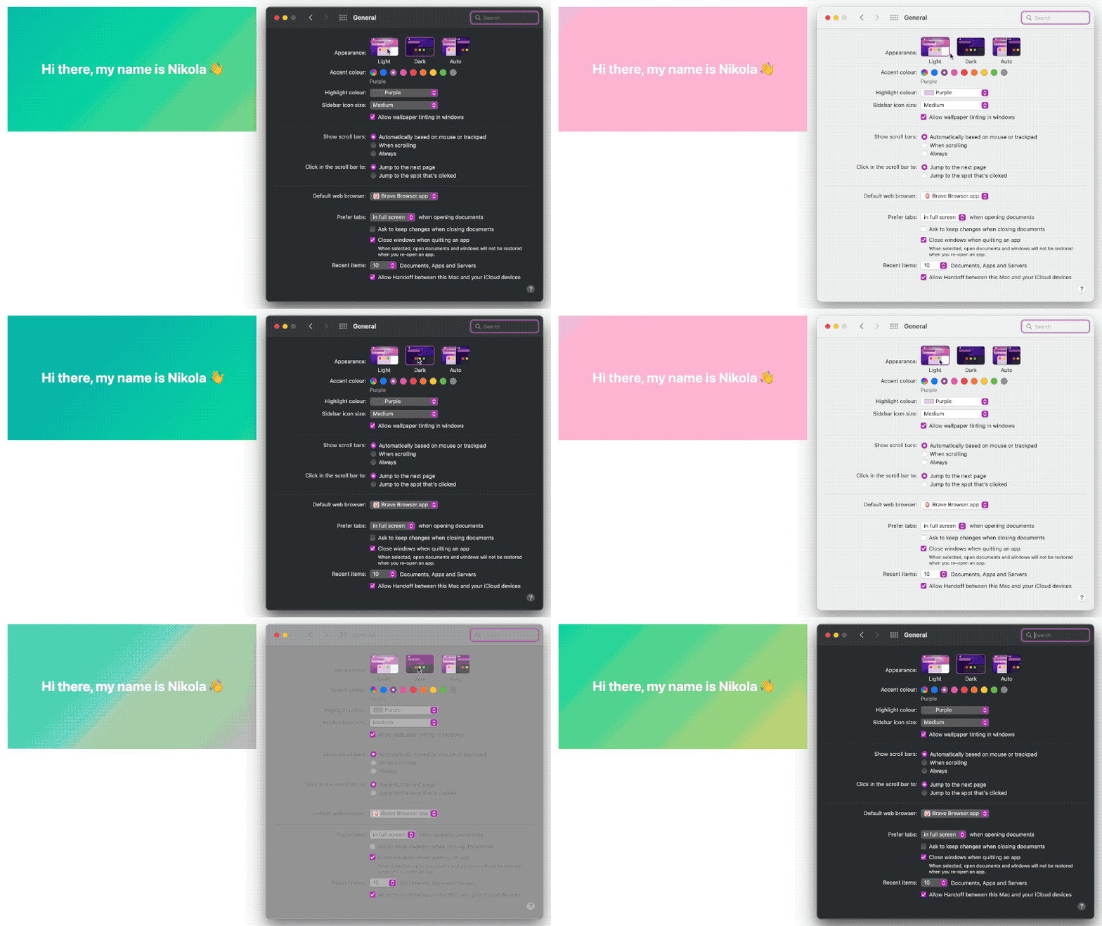
Here’s the final version (pro tip: toggle your system’s color scheme to see the gradient change):
And here’s how it changes depending on the color scheme:

What we did is the following:
.container {
  --color-main: #ef476f;
  --color-primary: #ffd166;
  --color-secondary: #06d6a0;
  --color-tertiary: #118ab2;

  background: linear-gradient(
    -45deg,
    var(--color-main),
    var(--color-primary),
    var(--color-secondary),
    var(--color-tertiary)
  );

  //...
}

@media (prefers-color-scheme: light) {
  .container {
    --color-main: #ffc8dd;
    --color-primary: #ffafcc;
    --color-secondary: #bde0fe;
    --color-tertiary: #a2d2ff;
  }
}
Now, when a user has a light variant of a color scheme, another set of colors will get applied to the gradient.
You must be asking now - how do I render the newly created SVG? Glad you asked - let’s jump into the next section where we will learn that.
Render SVG inside GitHub README
You can use the standard Markdown syntax for rendering an image like .
To show an SVG image in full width of a README on GitHub, you can render it like so:
<div style="width: 100%;">
  <img src="animated.svg" style="width: 100%;" alt="Click to see the source">
</div>
This makes sure that the width of an SVG is 100% of the width of the Markdown file so it shows up nicely.
Render local README files before pushing to GitHub
To be sure everything is working properly before you push to GitHub, you can use a cool tool called grip. The grip is a CLI tool written in Python and it uses the GitHub API to render your Markdown files. I installed it quickly with brew install grip and you can run it by just typing grip inside the repo with .md files and then pressing enter. It will then run a server with your Markdown files.
I decided to use grip because I wanted to test these SVGs on my mobile phone on the local network. If you want to do that or you’re just interested in how to do it, I wrote a blog post on how to preview a localhost website on a mobile phone.
To be able to preview the README file on your mobile, I ran grip like so:
grip . 0.0.0.0Now that we know how to preview README files without pushing them to GitHub, let’s see a breathing and living example in the wild.
Real-world example
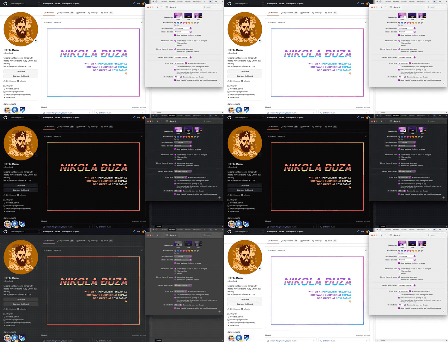
I pimped out my GitHub profile in the same way we went through in the above sections. You can check it out below:

Here’s the link to my GitHub profile repo and the actual SVG file that is rendered there.
I also created another repo with all the SVGs that we built today, take a look here.
Sum up
We went through how to create a simple HTML and CSS inside SVG, to fully animate and change CSS rules based on the user’s color scheme. We also saw how to render the SVG file properly in the Markdown file on GitHub. You are now ready to pimp out your GitHub READMEs. Go crazy!
Thanks for joining and reading. I hope this helps and/or inspires you to create something.
Until the next one, cheers.
Tagged as: GitHub
Join the newsletter!
Subscribe to get latest content by email and to become a fellow pineapple 🍍